Wells Fargo
Branding / Icon Design / A11y
Crafting icons with empathy
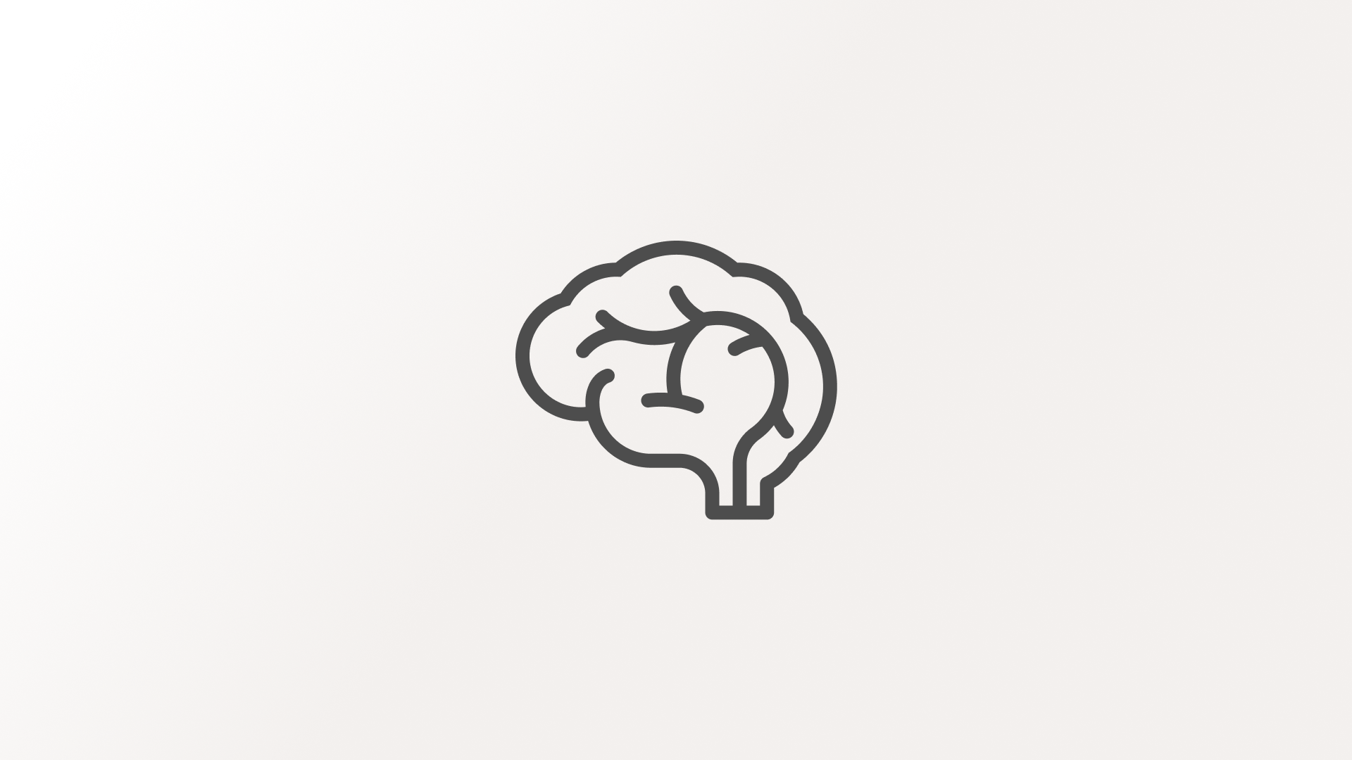
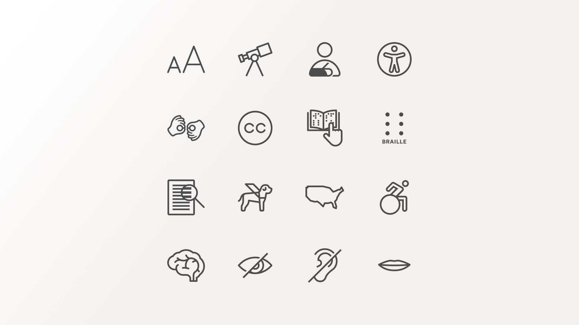
Wells Fargo needed an updated set of accessibility icons that aligned with their latest brand guidelines while improving clarity and consistency across the user experience. This project focused on refining both simple and complex icons — from Braille to guide dogs — with care, clarity, and inclusivity at the core.


The challenge
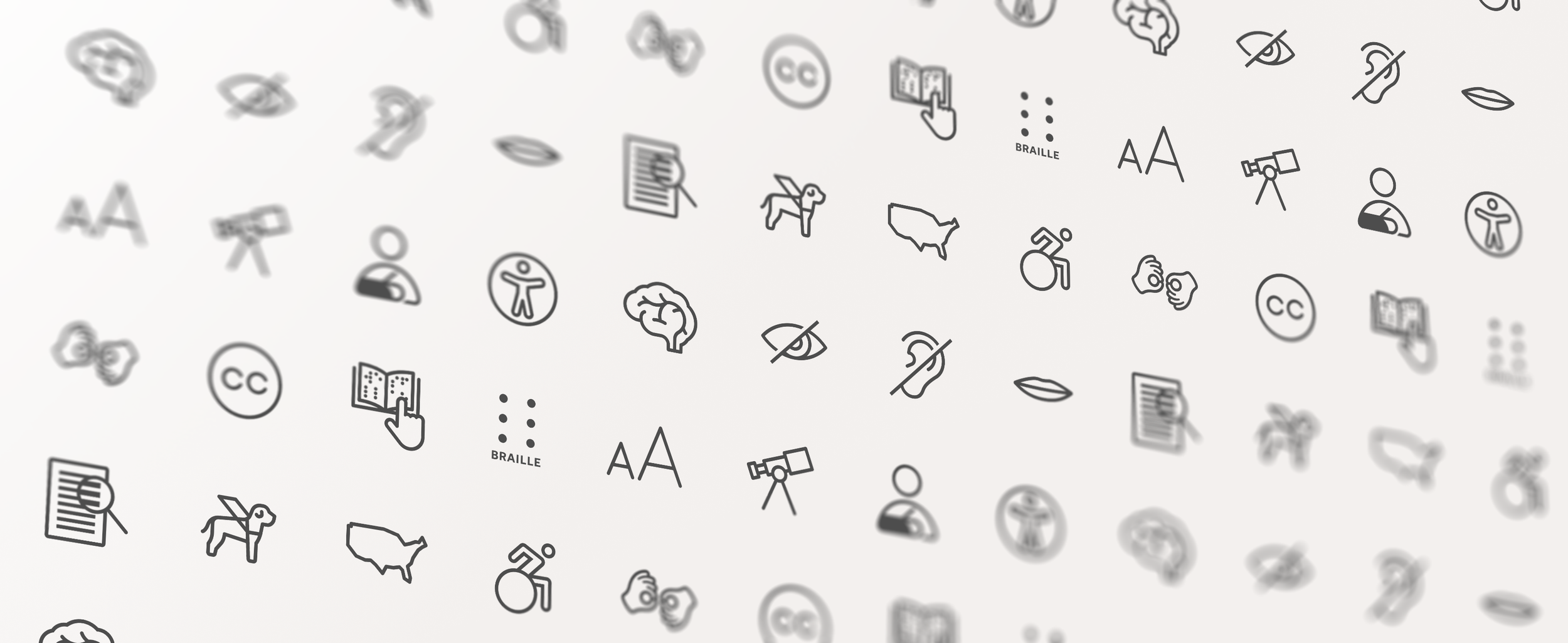
Wells Fargo’s accessibility icons serve a critical purpose: helping users with a wide range of impairments easily identify features and content relevant to their needs. The existing icon set lacked visual consistency and no longer aligned with the company’s updated brand system for iconography.
The challenge was twofold:
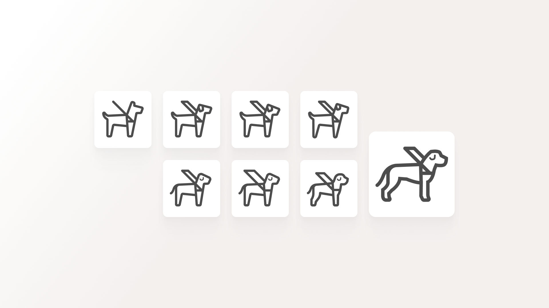
Create icons that were visually unified despite widely varying complexity (e.g., a simple six-dot Braille symbol vs. a detailed ASL hand sign or guide dog illustration)
Ensure every icon remained legible, meaningful, and on-brand — while upholding the accessibility principles that guide inclusive design

The solve
The icon set was reworked using Wells Fargo’s current visual standards for iconography, applying consistent line weight, curvature, and spatial logic across the full collection.
Each icon was carefully redrawn to strike a balance between clarity and visual harmony — whether it was a minimalist form like the Braille symbol or a more illustrative one like the ASL hand or guide dog. Despite their range in visual complexity, all icons were designed to feel like part of the same cohesive family.
Beyond aesthetics, the design process prioritized clarity of communication. The icons needed to be instantly recognizable and usable across screen sizes and contexts, while ensuring that each symbol conveyed its intended meaning intuitively and respectfully.


The impact
The new icon set brought alignment, accessibility, and design integrity back into a crucial layer of Wells Fargo’s user experience. The updated icons help users navigate with confidence — whether they rely on visual cues or assistive tools — and reinforce Wells Fargo’s commitment to inclusive digital design.
Internally, the project also ensured consistency in how accessibility was represented across all product areas, reducing confusion for both end users and design teams. While the work may seem subtle, the outcome was meaningful — providing all users with a more equitable, intuitive, and brand-aligned experience.