Google Top Contributors
Event Branding / Logo Design
Unifying people, products, and places
A global in-person summit was hosted by Google to celebrate and engage their top contributors — expert users of products like Gmail, YouTube, Google Docs, Sheets, Play, and more. The brief was to create a unifying brand identity and event experience that honored the diversity of attendees from 14+ languages and multiple continents, while seamlessly tying into Google’s broader design system and product ecosystem.


The challenge
This event brought together community leaders from across the world, many of whom were using and supporting different Google products. With over 14 languages represented and attendees entering from different countries, touchpoints, and venues, clarity and cohesion were paramount.
Complicating things, the experience spanned multiple locations:
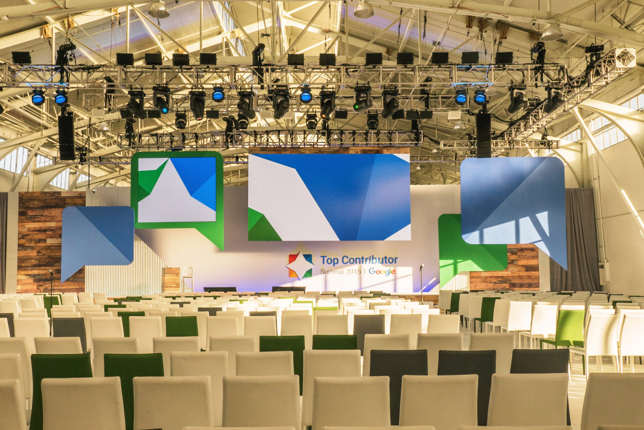
Fort Mason (main venue for keynotes and activations)
Google campuses in Mountain View and San Francisco (breakout sessions)
Hotels (check-in, social events, meals)
Multiple offsite party venues
The branding needed to:
Feel deeply connected to the existing Top Contributors program while introducing a fresh identity for this specific global event.
Flex across formal, festive, and functional contexts — from keynote stages to afterparties.
Accommodate international guests with limited use of language on signage while maintaining accessibility and brand consistency.
The project also had to stay agile — developed mid-transition as Google rolled out updates to fonts, color guidelines, and Material Design specs, requiring timely pivoting without sacrificing quality or confidentiality.


The solve
The creative foundation was built around the program’s key icon: the star, representing community excellence. To reflect both the “star” symbolism and the digital support culture of the community, the new logo abstracted Google’s chat bubble motif — rotating and layering four colored speech bubbles to form a unified star mark. Each bubble used a different Google brand color, referencing the diversity of contributors and the multiple product lines they represent.
A flexible visual language was built from this identity:
Color-coded wayfinding based on program tracks or session types
Large-scale signage and banners placed at strategic points across all venues
Window clings, wall graphics, digital screen templates, and playful language moments
To support multilingual accessibility, universal iconography was emphasized over text wherever possible (e.g., headset icons for translation equipment). Material Design principles were adapted for environmental use, reinforcing brand familiarity even outside digital interfaces.
Each touchpoint — from registration to breakout rooms, keynote halls to evening socials — carried a visual throughline that balanced Google’s brand with contextual storytelling. Even party signage felt festive yet on-brand.


The impact
The event delivered a seamless, celebratory experience across all venues. Attendees were able to navigate intuitively, regardless of language fluency or entry point. The color-coded system and visual cues ensured sessions started on time, without confusion or disorientation.
The branding struck a chord. Attendees captured and shared photos of even the smallest signage — including a last-minute printer-paper sign — reinforcing the community’s engagement with the design and attention to detail.
Internally, the creative approach was praised for:
Respectfully evolving the Top Contributors brand without losing its essence
Integrating cross-product representation within a singular identity
Navigating a mid-process brand system shift with discretion and flexibility
The end result was a dynamic and human event experience that felt unmistakably Google — while putting its most passionate users at the center of the story.


