TwitchCon
Event Branding / Wayfinding / Design System
Simplifying the attendee journey
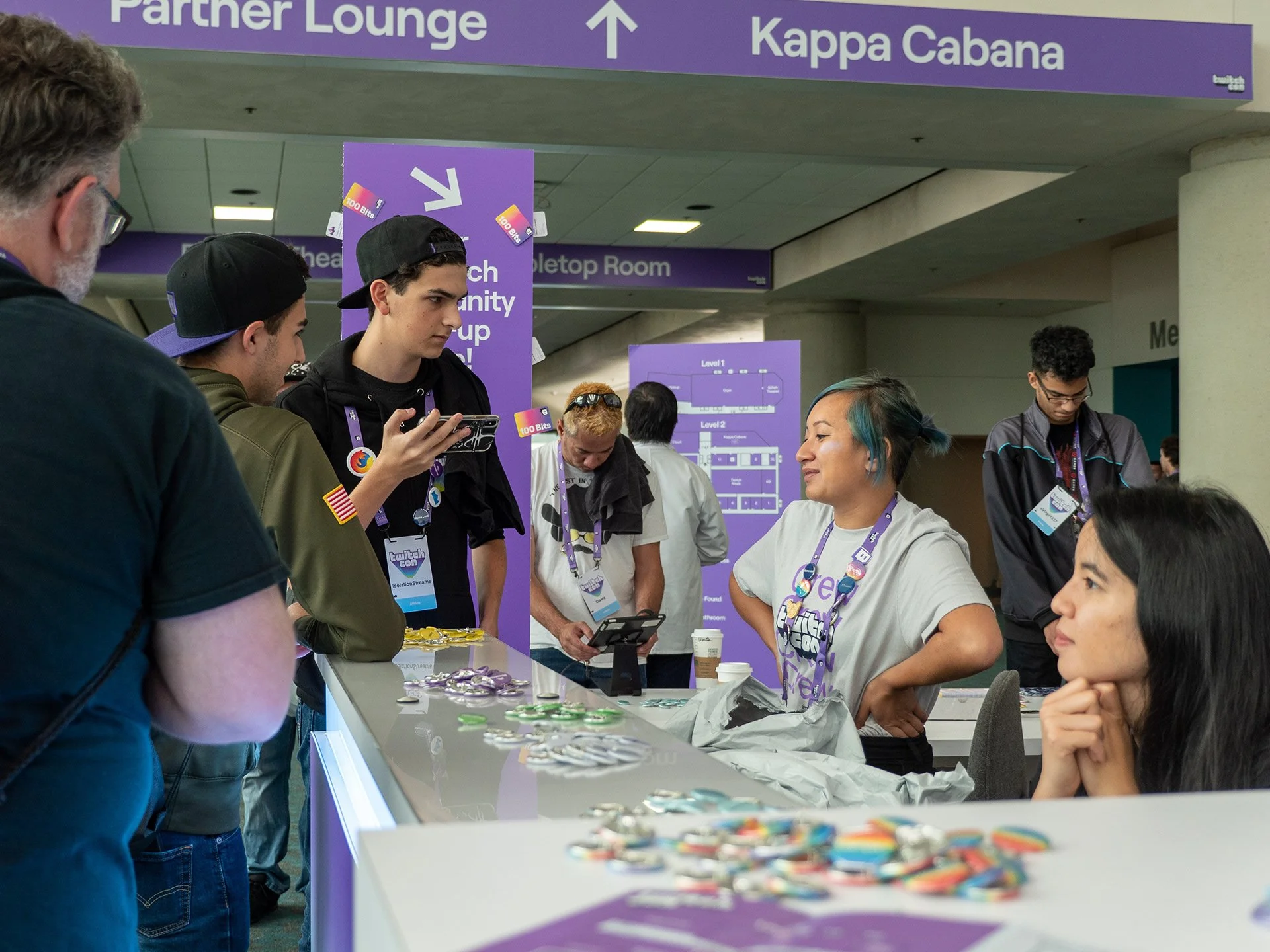
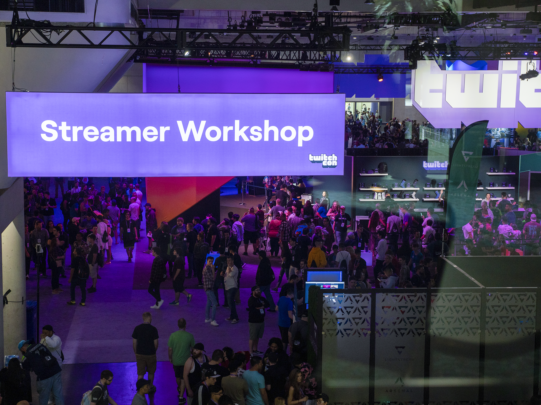
TwitchCon San Diego brought together thousands of creators, fans, and partners inside the massive San Diego Convention Center. This project focused exclusively on designing a consistent, easy-to-navigate wayfinding system that would stand out from the decorative and marketing signage across the venue.
The goal: make navigation feel effortless and intuitive in a high-energy, visually saturated environment.


The challenge
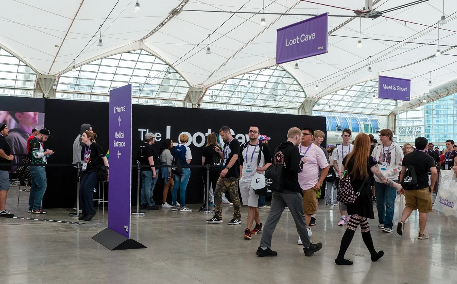
In past TwitchCons, attendees reported difficulty navigating the venue due to inconsistent signage, printing errors, and lack of a cohesive design system. The San Diego Convention Center posed a new challenge: massive floor space with highly varied signage formats — including tall vertical banners, wide-format displays, and small directional signs.
Additionally, the wayfinding system had to be visually distinct from TwitchCon’s branded graphics and decorative signage, yet still feel cohesive and on-brand. It needed to help attendees orient themselves and move confidently through a space that could otherwise feel overwhelming.

The solve
The visual solution prioritized clarity and consistency using minimal elements:
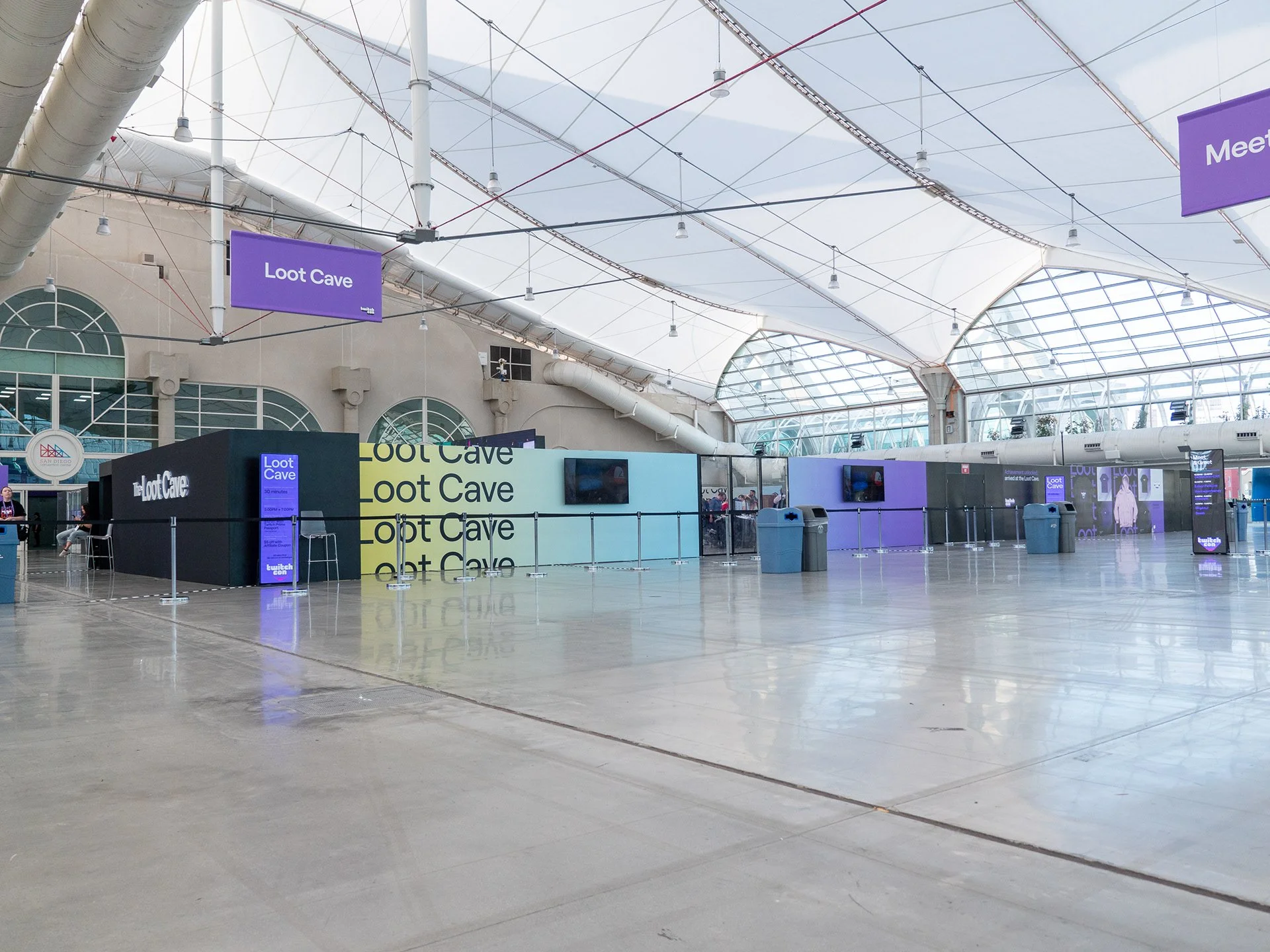
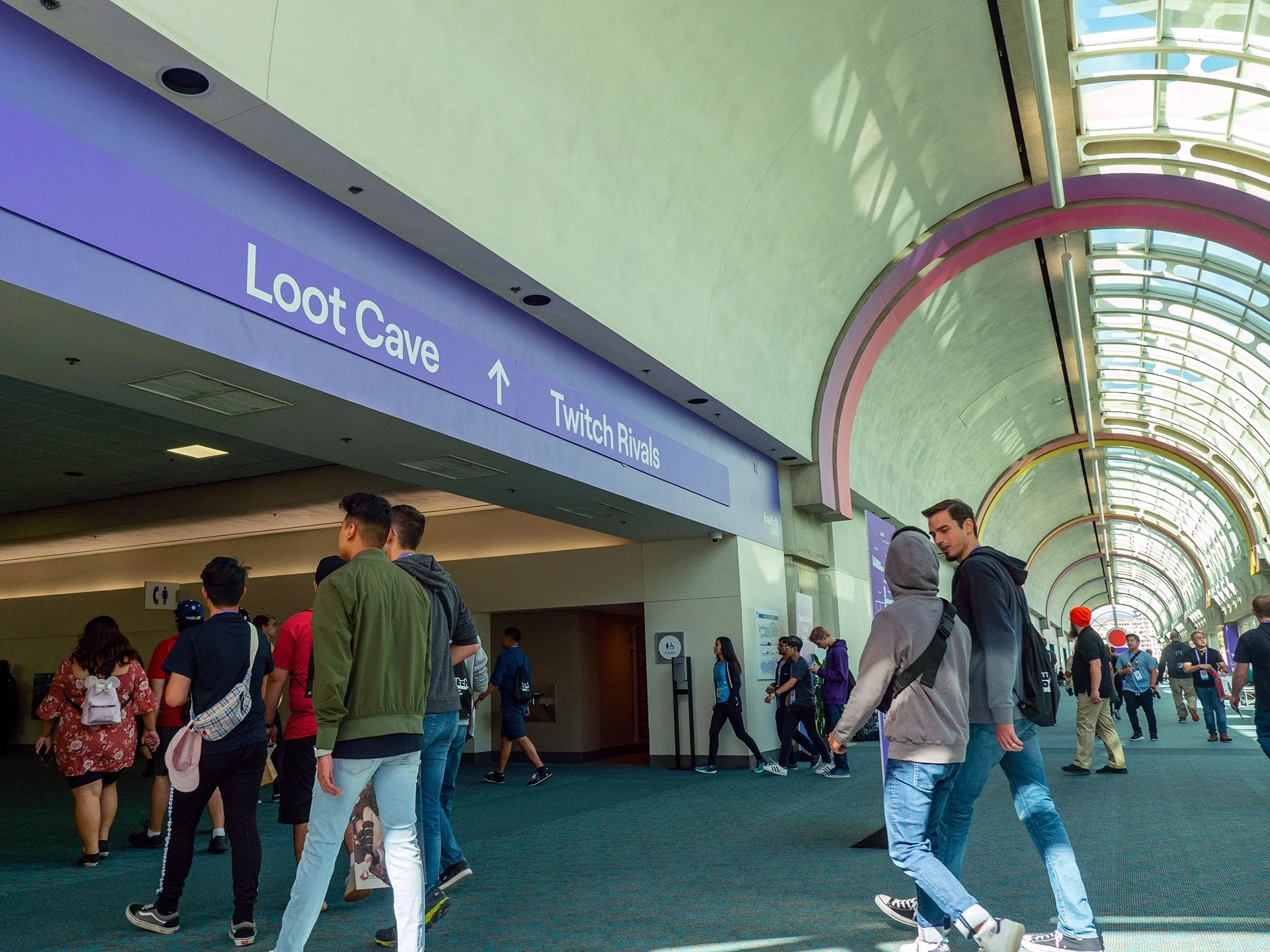
A solid purple background using Twitch’s branded color
Simple white typography indicating destinations or directions
Directional arrows (when applicable)
The TwitchCon logo, consistently anchored to one corner (typically bottom right)
To ensure scalability across extreme aspect ratios (from tall banners to ultra-wide signs), a grid system was developed using the shortest edge of each sign as the base unit. This created:
Consistent margins and padding
Predictable logo placement
Scaled typography that maintained uniform proportions regardless of sign size
This grid-based system served as the foundation for a design guide that enabled multiple designers to build out signage assets with confidence. Documentation included rules for layout, type sizing, logo placement, and exception handling — enabling streamlined production and quality control at scale.
The signage system was also extended to digital displays and a printed attendee map. The map design followed the same visual language, and was distributed both physically and digitally through the event app.

The impact
While difficult to quantify with hard data, the impact was visible in the attendee experience. There were significantly fewer questions around navigation, and guests moved through the space without confusion or needing to ask staff for directions. The consistent sizing, placement, and visual logic of the signs allowed attendees to intuitively recognize wayfinding elements across the venue — even in a space filled with competing visual stimuli.
Staff reported fewer complaints related to signage or directions, and the production team avoided the common pitfalls of previous years, thanks to the well-documented design system. Even with dozens of sign sizes and formats, the final result delivered visual consistency, clarity, and a smoother attendee journey.